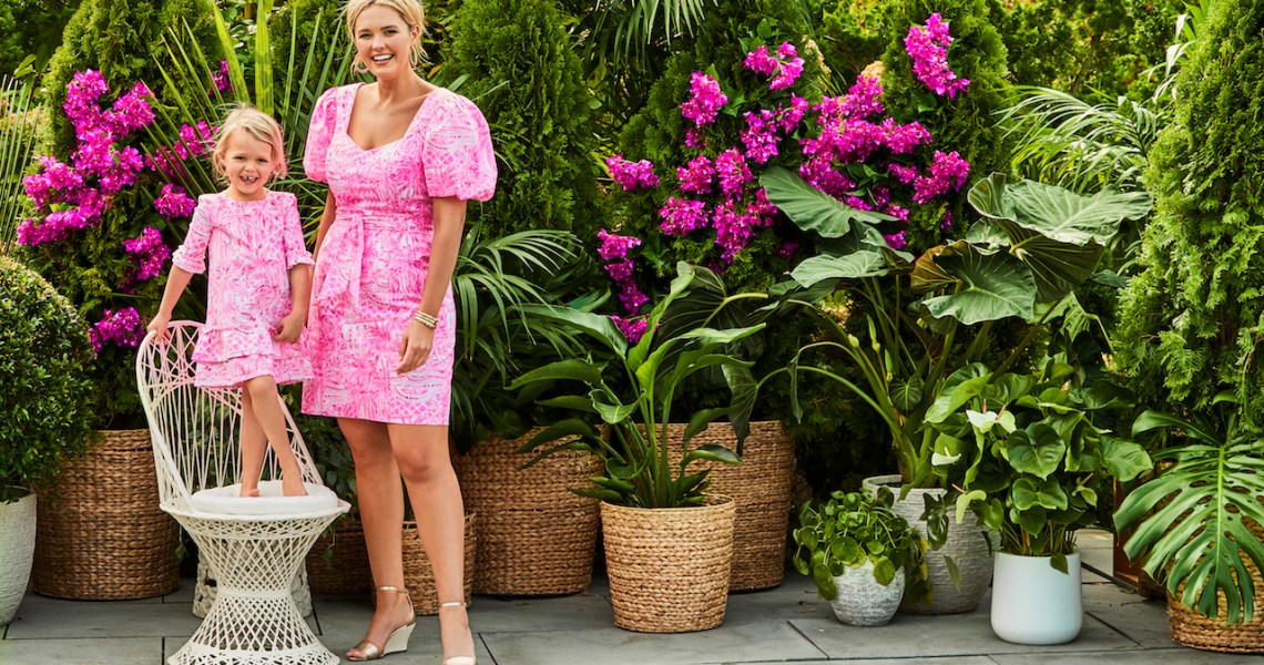
In Net-a-Porter’s spring/summer 2021 trend report, released on Monday, the online luxury retailer noted an emphasis among its brands on “joyful dressing.” Think: clothing in bright colors and with cheerful prints.
For the season, Net-a-Porter bought more than 3,000 bright-colored dresses from brands including Tove, Roksana and Christopher John Rogers, according to the report. In addition, it stated that the brands had “captured escapism through color, texture and prints such as tie die and paisley.” Similarly, a wide-ranging report from Edited called out the trend of bright neon colors in fashion, noting that the spring/summer collections of brands like Versace, Balmain, Jason Wu and Stella McCartney heavily featured dayglow colors and bright psychedelic patterns. One piece from Stella McCartney’s spring 2021 collection — a brightly colored sweater with multiple overlapping patterns and the word “SMILE” embroidered on the front — sold out multiple times, according to the Financial Times.
The ideas of escapism and joyful optimism were common refrains among fashion brands and retailers throughout 2020, with many brands positioning their clothes as a way to alleviate the Covid blues. Even the annual Pantone colors of the year for 2021 — a dull concrete gray and a bright lemony yellow — seem to acknowledge the dichotomy between the bleak national mood and the optimistic colors in fashion collections. Net-a-Porter and Matches Fashion have bought heavily into color for spring, and some brands are adjusting their inventory to match the demand.
For example, DTC fashion brand Aday, which has never been known for color, has adjusted its inventory accordingly. Aday co-founder and co-CEO Nina Faulhaber said the brand has typically launched new products in only a few neutral tones — a running joke early in the company’s history was that everything was either black or white. But over the course of 2020, it began introducing colors like green, mustard and orange in new products. She said that, in a review of requests from customers through the brand’s emails and social media comments, more and brighter colors was the No. 1 request over the year. Sales of colored and bright styles outweighed dark styles between August and September 2020, with sales of the brand’s signature Something Borrowed shirt being 76% whites and colors and 24% darks.
“That idea has also translated into how we do our creative,” Faulhaber said. “We’ve been shooting campaigns with brighter colors, in colorful locations like Lisbon or outdoors. We’ve avoided using specific terms like ‘joy,’ because Marie Kondo kind of owns that word, but that’s exactly the phrase we use when we’re planning our marketing internally.”
Aday also launched its first pattern in 2020: simple stripes. But Faulhaber said two Aday designers have been tasked with bringing more patterns in more colors to future collections.
Meanwhile, for Lilly Pulitzer, bright colors and prints are core to the brand. Mira Fain, evp of design and productive development, said the brand saw a 25% increase in new customers in 2020. Because the brand hadn’t altered its strategy or style from 2019-2020, she attributed the boost to consumer demand for the Lilly Pullitzer’s signature aesthetic.
The brand also sold fewer black clothes in 2020 than the year prior, marking a first for the company. Fain theorized that customers staying at home not only need a pop of color to keep their spirits bright, but they’re also are more willing to experiment with louder colors and patterns when working from home and only dressing for themselves. That idea has permeated the brand’s marketing strategy over the last year.
“We pivoted our typical spring marketing, which would be focused on things like Mother’s Day and gatherings, and all these social events. Instead we’ve focused the messaging on dressing for yourself and making yourself happy,” said Eleni McCready, senior director of media, promotions and community development at Lily Pulitzer, referring to the spring collection which launched on Friday.
Fain said recent conversations with retail partners like Nordstrom and Saks Fifth Avenue have been dominated by a demand for comfort wear and brighter colors. That’s a claim backed up by Edited, which documented the many ways retailers and brands heavily played up colors like yellow, orange, blue and red in their marketing throughout 2020.
“We saw this idea emerge in early 2020, with retailers using bright colors and patterns to lift spirits and spread positivity,” said Venetia Fryzer, retail analyst at Edited. “Now that consumers are becoming increasingly frustrated and bored of living in sweatpants 24/7, we have witnessed a resurgence of this within retailer communications. Pinks are particularly noteworthy now, while yellow is also on our radar [thanks to] Pantone.”
Fainpredicted that bright colors and bold patterns will continue to be a dominant trend throughout 2021, with vaccinations and the return of social gatherings only fueling the fire.
“The last nine months changed the way we live,” Fain said. “We’re going to enter an era like the roaring ’20s. Style will be euphoric, maximalist, literally a resetting of everything. And colors will be a way to express that.”


