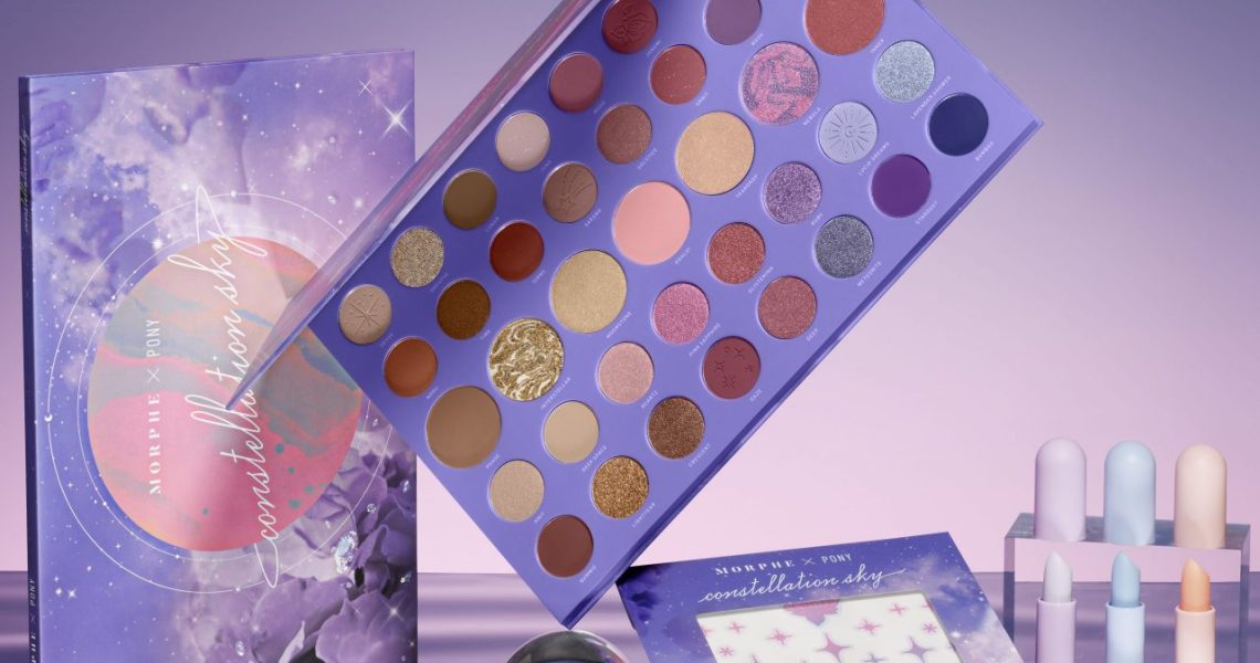
Pony (aka Park Hye Min) is one of South Korea’s most popular beauty influencers — and one of the few whose popularity has translated stateside, too. She has 7.6 million followers on Instagram, 5.8 million subscribers on YouTube and over 400,000 followers on TikTok. In early 2020, she collaborated with Morphe to promote its Icy Fantasy collection, a collaboration that was about “showing her makeup skills.” This time around, it’s more personal: Launching on November 18 is Pony’s latest Morphe collaboration, for which she worked on every element. The collection includes trend-forward face and body decals in celestial-inspired shapes, three sheer-but-shimmery lip tints and, the pièce de résistance, a 39-shade palette. We spoke to Pony via Zoom about the new products, the beauty trends in Korea and America, and her mega social media following.

You’ve worked with Morphe before. How is this collection different than the last time you partnered with the brand?
“[With the first collaboration,] the 35I Icy Palette already existed. So my role was to take that palette, use those colors, and show my skills and artistry, and show how somebody in Korea could use the palette. This collection is different because I’ve been involved from day one. I came up with the colors, the design, the whole conceptual vision of the project — the cosmic vibes. Both projects have been very meaningful to me.”
How do you even go about creating a palette?
“For a large palette with 39 colors like this one, instead of taking it color-by-color, I think about it in a larger way. So, I first thought about what the concept [would be]. Then, I narrowed it down to the colors. This palette has such a wide variety of colors. I thought about what neutral colors could be used to help build up the vivid ones and make them pop. Then I thought about the colors that can go in-between, and also how we’d display them. Where would the colors go on the palette that would help it make sense, appeal to the eye and be usable on the face? When everything was in place, then we had to name the palette! So ours is Constellation Sky. And once you name the palette, you have to name every color in the palette. And that’s a very fun and exciting thing to do.
Also, fun fact: All four of my cats’ names are in the palette! One of my cats is named “Bum.” But in English, bum means homeless person, so we called [that shade] “Bummy.” And I drew the designs that are etched into some of the shades.”
Were you going for more of a K-beauty look or an American beauty look?
“I didn’t have a particular person, or type of person in mind. I was making it for myself. I am Asian, I have an Asian face. But I always try to challenge those norms by trying makeup looks seen in America or Europe.
Morphe is more well-known in the Western world, like in Europe, Australia and the U.S. So I definitely did keep that in mind when I was putting together the entire collection and choosing the colors. But I wanted to make this palette available for anyone to use. That’s why there is such a good balance of the neutrals and the vivids for people who may be a little bit more apprehensive, but want to get that little pop of color. It’s all available.”
Do you think trends are becoming more similar in Korea and the U.S., as the world gets “smaller” and more connected?
“With the development of the internet and more people being on social media, we are seeing a lot of new trends [from around the world] that would have taken a lot longer for us to see before. But I think there’s still a specific look and identity of makeup looks in different parts of the world. Not everything is totally a melting pot just yet.”
What else should we know about the collection?
“Because we’re in the middle of a pandemic, I couldn’t do things the way we normally would. So this process really started with me at my computer drawing out renderings, working on Photoshop and sending that over to the team at Morphe. The challenge, of course, is that every screen — whether it’s on an iPhone or Android, a different blue light setting is on, or it has different contrast levels — looks different. But that’s how I developed the initial color story.
When I got the first samples back, some of the colors were too vivid. In Korea, these shades are OK — this is one of the differences between makeup in Korea and the states. In the states, when you swatch a color, you expect payoff. In Korea, you see these colors, but that might not be what you actually get when you swatch it. You see a little bit of that muted, that milky… We want these colors, but we want the payoff to be as if there was one drop of milk added into it. So you’ll see this kind of milky theme throughout the palette.”


