This is an episode of the Glossy Beauty Podcast, which features candid conversations about how today’s trends are shaping the future of the beauty and wellness industries. More from the series →
Subscribe: Apple Podcasts • Spotify
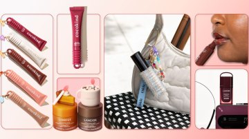
The Glossy Beauty Podcast is back with its second of three deep dives into beauty packaging. Today, our guest is Helen Steed, a veteran in the field, whose resume includes a 10-year stint leading creative at Bumble & Bumble, and a gig as Glossier’s founding creative director before striking out on her own. Now, she helms Steed & Friends, which has worked with brands including Rhode, Lore, Sakara and Ursa Major. On today’s episode, she takes listeners through mini case studies, examining her work on products like Rhode’s iconic phone case, Glossier’s first foray into body care and Merit’s logo.
But first, a look at some of this week’s headlines, including the news of L’Oréal’s biggest acquisition ever, which broke on Sunday — it is purchasing all of Kering’s beauty holdings for $4.6 billion. Kering owns brands like Creed, and the deal will grant L’Oréal 50-year exclusive licenses for Gucci, Bottega Veneta and Balenciaga’s beauty ranges.
Below are highlights from the episode, which have been lightly edited for clarity.
Designing Glossier’s first body products
“When we were thinking about Glossier Body Hero, one of the considerations was what we used to call the ‘Aesop Test.’ You could see Aesop when it showed up in an image, [even] a tiny image, [or when] it showed up in someone’s bathroom. You could spot it, and you knew what it was. And we wanted Glossier Body Hero to show up in a similar way: [where] you could spot it in an image, [in a] bathroom, in a shower, in a busy environment, and you would see it, and it would jump out. [And that] is quite different [than designing a product that lives on] somebody’s vanity or close up in somebody’s hand. So, we really thought about how we could approach the bottle and the graphics in a way that’s a lot more punchy, grabby, impactful. … [Our] packaging design lead had this great idea [to] flip the bottle, [which] basically [meant that] the information you would normally have to have on the front of the bottle, we [moved] to the back. So, the front had this big G [and] this stripe. We wanted it to feel sporty. … It’s always about: ‘What is that product, and what does design of that product … tell you in the way that it shows up? We wanted it to feel sporty and fresh, but still have all those Glossier codes, in terms of the pink and the red, and the stripe around the cap.”
The early stages of Merit’s brand design
“[Katherine Power] was really thinking about wanting products in her life that were clean and that felt better for you, but didn’t pick up on the same design codes [that] were in clean beauty at that time. And she actually did say, and impress at the time, [that] it was a grown-up Glossier — more sophisticated. It should feel like it doesn’t have to be for an older customer, but it should be for someone with a bit more of a mature outlook, who buys in terms of fashion and lifestyle and their home. They like to have those really nice pieces — they’re very selective and edited — and it was definitely about ‘less is more.’ [It was] interpreting that in a way that [the product] should feel like a fashion item. It should feel like that piece of jewelry you love to wear or maybe even that watch that you inherited. So there was a timelessness to it, but also it needed to feel modern. … Even for the logo mark, we referenced vintage cars. We didn’t want it to be soft and too flowery. We wanted it to feel like it had a strength, because this woman is strong. And then, with the packaging, we wanted it to feel eclectic — so it feels like a collection of things from in your world, as opposed to a lineup of products that look identical, which, is kind, of [how] the older world of beauty [is].”
The Rhode phone case brief
“The team [at Rhode] said, ‘We’d love for you to think about some some merch ideas.’ They wanted us to think openly, in terms of: What are the brand codes? How can we lean into some of those brand codes — puffy, glazed — and that sort of high-low mentality, as well? And they wanted us to think about it across a range of merch items, one of which was, ‘We’d also love for you to think about, ‘How can we attach Peptide Lip Treatment to the iPhone?’ We probably did over 50 ideas, just loads of different ideas. There were lots of different ideas around the iPhone: Could the Lip Treatment be a piece of jewelry? Does it hang off? Does it attach? They really loved this one idea — this iPhone case that was kind of puffy. [And when it launched and people saw the case] showing up in [Hailey Bieber’s] world, just those iconic photos of her holding it, it was instantly viral. We really didn’t know that it would be that popular, but it was. It was fascinating to see it. I loved seeing all the spoofs, as well. I’ve collected them.”